A Restaurant’s Fate and Business Failure Rates

“All the restaurants we like shut down! It must be a curse”, a friend of mine recently told me, after lamenting the closing of yet another one (the 4th to be exact) of the eateries she had visited. Not believing in curses, but having a firm belief in data (and in dragons, but that’s not relevant now), I decided to dig a little deeper.

As usual, in these circumstances, the Office for National Statistics comes to the rescue, with its “Business Demography” dataset. The data looks at enterprise birth, deaths and survival numbers and rates in the UK, both by sector and by region. Having gotten hold of the data, I got a bit carried away in the analysis. Here is what I found out.

I don’t want to end up bankrupt. Should I open a restaurant or an IT services firm?

1

Definitely an IT services firm. Looking at macro sector groups,  IT and Healthcare are the sectors with the highest survival rate, while Business admin and support and Food services (including restaurants) take the cake for being the riskiest.

While the average survival rate for 1 year old businesses is about 90%, this drops to a little over 40 by the time they get to be 5 years old. The drop is valid across the board. For a manufacturer, we would expect the first couple of years to be tougher, meaning steeper lines for the first data points, and later the survival rate would improve as the business becomes more established. This does not appear to be the case.

Do things get better or worse?

23

Some sectors start up pretty good, that is, with a high survivorship rate. However, as the years go by, the rate drops dramatically. On the contrary, other sectors are more stable: given a failure rate, it tends to or vary less across time. In particular, it appears that sectors that start with higher failure rates tend to be more stable. For example, insurance and pension funding has a high failure rate, however there is only a 25% difference between the average survival rate in year 1 (41%) and year 5 (17%). Contrast this with landscaping businesses: the failure rate is only 7.5% for 1 year old businesses, but increases dramatically to 71% by year 5, a difference of 65 points. It is interesting to note that the sectors where the survivorship rate tends to drop the most also tend to be quite resilient in the first couple of years, plummeting thereafter, while sectors that are more “stable” tend to have higher failure rates to start with. In summary, you will have a much rockier ride with sectors in the second chart. And guess who is featured prominently in the second chart? Restaurants and food services!

Easier to open, easier to fail?

4a

If it very easy to open a business, if there are few entrance barriers to a sector, we would expect it to fail more easily. I decided to test this by regressing average survivorship rates against number of births during the period. Analysing the relationship on a group, sector and subsector level and aggregated both across years and year by year, the regression showed that sectors with more “births” had indeed a higher failure rate, however the explanatory power of the relationship was very low (4% R^2 on average). If we have a look at the graph, we can see that indeed the relationship does not seem to hold: if ease of opening were correlated with survival rate, we would see more smaller bubbles towards to top right hand corner of the chart (size of the bubble = births of enterprises in the sector across the time period). However this does not seem to be the case.

4

If we zoom in towards the top (see above chart) this is even clearer. In summary, there appears to be no correlation between number of businesses and survival rates. At least in this dataset. So, in spite of restaurants being the 5th most  popular business to open (they come after management consultants (!), business support services, computer programming and technical and scientific activities), there is no evidence to conclude this would make them more prone to failure.

So what about that curse?

Granular data on failure rates by type or restaurant, whether or not it belongs to a franchise or where it is located is not readily available, meaning we’ll have to make do with what data we have. And a healthy dose of approximation.

6

  • Restaurants in general tend to fail at an overall higher rate than the average businesses; however the discrepancy is not much. Moreover, eateries tend to survive more during the first years compared to the average business (see chart above).
  • Businesses in London tend to have a lower survival rate compared to the national average by about 2%, and that is constant throughout the sample years.
  • According to ONS data, an average Briton eats out at least once a week, but the average Londoners eat out more, although they do not necessarily go to a different restaurant every time they eat out.
  • Given the stock and the number of new restaurants opening every year, we can calculate that about 15% of the existing stock opens every year .
  • Given that people have a tendency to try out new places, we can assume that the probability of visiting a restaurant younger than 5 years is higher than mere random chance.
  • Using the data, and extrapolating, I assume the failure rate to be marginally decreasing in time.

8

Based on these calculations, the total failure rate within a year for all restaurants is about 12%. As my restaurant aficionado friend eat out quite often (I myself only go out to get ice cream), I can safely assume they have visited 50 restaurants over a year. This would get us a total of 5.5 restaurants failures within the ones they visited. So no, it is not a curse, it is just business (and failure) as usual.

Notes and caveats:

  • All data sourced from the ONS, here, analysis by yours truly.
  • The data only covers the period from 2010 to 2015, so conclusions could not be universally applicable. In addition, this means that, while I have 5 data points to calculate averages for 1 year survival rates (2010 to 2015), I can only use one data point for the 5 year survival rate (2010). This may skew the analysis, if for example the failure rate for businesses started in 2010 was considerably higher than in later years. This is what happens with the insurance sector for example.
  •  I excluded subsectors where the number of enterprises founded over the 5 year period covered by the data is lower than 500 (I thus excluded roughly the bottom 15%, 11 subsectors out of 81). The threshold is to achieve significance in the survivorship rates.
  • If anybody knows of a dataset that breaks down the failure rate by type of restaurant, please let me know, because otherwise I will be forever haunted by requests coming from a certain friend to find it and come up with a “proper” analysis.

Education and Migration

On one of my periodic expeditions in the land of the internet, I came across two datasets on immigration, and I decided to have a look at what the numbers say. The data is sourced from the UN and the OECD. Here is what I found.

The first two maps are made using UN data and an ingenious choropleth solution for excel. If you want to know more, visit this blog.

Living abroad as % of home country population

The redder the country, the more people are…running away. It looks like Eastern Europeans don’t really want to stay home, while people from the US, China and Japan for example, tend to not emigrate as much.

foreign born population border

Let’s now look at the other side of the coin: what percentage of the resident population is made up of people born abroad? The redder the country is, the higher the proportion of immigrant population. We can immediately see that the US, Canada and Australia have quite a high proportion of foreigners living within their borders.

Analysing the data from the OECD, I focused on the relationship between immigration and education levels. Let’s take a country. We can divide its population in three big buckets: people born and living in that country (Italians living in Italy for example), those born in the country and living abroad (Italians living in the UK) and foreigners living in the country (French living in Italy). We can then look at what percentage of “remainers”, emigrants and immigrants have tertiary education.

Emigrants with tertiary Education

The first chart depicts the relationship between the percentage of “remainers” with higher education and the percentage of emigrants with higher education. The size of the bubbles shows how many people are leaving their​ countries. We can immediately see that emigrants tend to be higher educated then their compatriots who remain at home. Take the UK for example. About 22% of the population has a degree, however more than 40% of the Brits living abroad has completed higher education. Here are some hypothesis as to why:

  • more educated people tend to want to find work abroad,
  • more educated people are more mobile,
  • younger people are generally more educated and also tend to be more willing to move abroad

The data only covers OECD countries, which are generally considered more developed. That is, we are only looking at people born in more affluent countries who decide to leave and live abroad. If data was available for developing countries and emerging markets, I have the suspicion that we would see quite a different relationship. It may as well be that educated people born in emerging markets will emigrate, however they would represent a smaller proportion of the total emigrant population (simply because tertiary education is not as prevalent in EMs as it is in developed nations).

immigrants with tertiary education

Lets now focus on the other side. We can look at the percentage of people coming to a country from abroad. In this case, the OECD data captures all migrants moving into the OECD countries, therefore the numbers also reflect citizens of emerging markets and developing countries moving to the US for example. The analisys is very different. As we can see, countries are more clustered together and there doesn’t seem to be a strong difference between education levels between immigrants and born residents. It is interesting to note that if the country takes in more immigrants, that is, the side of  a the bubble is larger, the immigrant population seems to be less qualified. I divided the sample into two buckets, one where countries have less immigrants than the median and one where countries have more immigrants than the median. The former group has an average of 30% of the immigrant population with a degree, the latter only 25%. Granted, the difference is not very large, but still statistically significant. The most striking example is Japan. I suspect this may be due to restrictive  immigration policy: countries that do not let people in have more stringent rules that favor qualified immigrants.

A couple of caveats on these two charts:

  • Immigrant population is measured using resident population, so does not take into account temporary workers
  • I have narrowed down the population under study to people of working age (25-64 years old). This is because it is unlikely many 15 year olds will have completed higher education. However it is usually true that younger people tend to be more educated (it wasn’t very common 50 years ago to go to university) so countries with younger populations (for example New Zealand) may appear more “educated” compared to countries with older populations (for example Italy).


Measuring Private Equity: Time Weighted Returns

Money multiples have a fundamental flaw: they do not account for the time value of money: doubling your money in the space of 5 years is certainly better for the investor compared to doubling it in 10 years. To measure how Fund managers have achieved performance across time we can use three metrics: time weighted rates of return, IRR and Horizon IRR.

  1. Time weighted rate of return (TWRR) is a concept borrowed from the public market. Essentially, we try to measure the return of an investment without considering the impact of cash flows. In the context of the stock market, simple rates of returns would be calculated between every cash flow. So if the investor buys 10 shares in April, sells 5 in September and then closes his position in December, we would calculate a return between April and September and another one between September and December. A TWRR would then be calculated compounding returns for every period.For private equity, we consider when a fund buys and exits investments. We then calculate the value of the portfolio before and after each transaction. The value of the portfolio is

FV of existing investments + New investments – Exits proceeds

We then compute the periodic return for each year. Calculating the geometric average for the entire period we obtain the TWRR

 TWRR

  1. Internal Rate of Return: to define IRR we must first start with defining Net present value. The net present value is the sum of the present values for all cash flows discounted at the relevant cost of capital. The IRR is the rate of return that, when used as cost of capital, makes the NPV sum to zero. To compute IRR, we use an iterative process. Or excel, which is usually a lot easier.

irr


  1. Horizon IRR is simply an IRR computed over a specific time horizon, to see how the performance of the fund has evolved across time. To compute Horizon IRR, we look back to x number of years. For example, for a 1 year horizon IRR, we look back 1 year from now. For a 6 years Horizon IR, we look back 6 years. To do so, we assume Fair value as of that year to be the first cash outflow. We then compute the IRR in the usual manner The Horizon IRR can also be run over any time period, always treating starting fair value as a first cash outflow and last fair value as a final cash inflow.

horizon IRR


Pros of Time weighted returns

  • They take into account the time value of money
  • They are a complementary measure of performance together with multiples


Cons of Time weighted returns

  • They are harder to interpret compared to multiples
  • We could encounter situations where IRRs cannot be computed or where an IRR calculation has multiple answers
  • IRRs and TWRR are very sensitive to changes in timing of the cash flows. Two funds with the same money multiples could have very different IRRs.
  • IRRs assume that all cash distributions are reinvested at a rate equal to the IRR, which is in many cases, not possible.
  • Horizon IRR and TWRR use interim Fair values to compute period rate of returns. The Fair values may not be accurate

Measuring Private Equity: Multiples

When general partners report their performance, they typically quote two numbers: return multiples and IRR. Although each taken on its own does not offer a complete picture, when used together these two measures help LPs judge a private equity fund’s performance.

Return multiples are the easiest to calculate and to use. They provide a simple and straightforward way for LPs to quickly grasp what the performance of a fund has been. There are three main return multiples .

DPI

  1. Distributed to paid in (DPI): also called realised multiple, DPI is computed dividing the sum of proceeds from a fund by the sum of invested capital. DPI is a good measure of performance once the fund starts exiting investments, typically towards the end of its life. If the fund has not exited any investment DPI will be close to 0x, and not provide a very useful insight into the performance.

RVPI

  1. Residual value to paid in (RVPI): also called unrealised multiple, RVPI is calculated by dividing the outstanding fund fair value by the cumulative invested capital. RVPI is a good measure of performance at the beginning of the life of the fund, when no investment has been exited yet. As the fund ages and as investments are exited, RVPI will decrease to 0.

TVPI

  1. Total value to paid in (TVPI): TVPI is the most “complete” of the multiples, and it is computed by dividing the sum of outstanding fair value and proceeds by the total amount invested. It is therefore the sum of DPI and RVPI and as thus can be used to assess performance during the entire life of the fund

As multiples take into account the cumulative invested, disbursed and received amounts, they are a useful indicator of a fund’s position within the J curve. As investments tend to plateau after the end of investment period, which typically lasts 5 years, TVPI tends to stabilize, DPI increases as capital is returned to Limited Partners and RVPI is reduced.

Performancemultiple

Pros of Return Multiples

  • They are easy to calculate
  • Thy are easy to interpret
  • Finally, multiples are easy to communicate

Cons of return multiples

  • Multiples do not take into account the time value of money. Achieving a 3x multiple over 15 years is surely less desirable than achieving a 3x return over 5 years.
  • RVPI and TVPI rely heavily on Fund managers’ valuations, which may or may not be accurate.
  • Multiples do not take leverage into account. If the fund manager was able to achieve a higher multiple thanks to leverage this is not reflected in the computation.
  • And finally multiples do not take into account the recycling of capital. Instead of distributing cash flows, GPs can reinvest the proceeds and thus achieving a higher multiple, as they increase FV and proceeds in the future while the sum of invested capital remains constant


500 euros for 18 year olds: a brilliant idea. Or is it?

“The 550 thousand Italians who will turn 18 will be able to take advantage of a card, a 500 euro bonus card each, to take part in cultural events. “ With these words the Italian Prime Minister Matteo Renzi has announced one of the measures with which he plans to combat terrorism: defence and cybersecurity and culture. 500 euros for everybody who turns 18 this year. With about 550 000 young people who will be eligible, the total cost of this measure for the Italian state will be EUR275m. But is it really worth it?

Reasons why the 500 euro bonus makes sense

  1. It will encourage young people to discover and enjoy the treasures that Italy has luckily been endowed with. This would push teenagers to visit more museums, go to the teather and overall participate in cultural activities. Which can never be bad.
  2. It will increase funding to museums and cultural events. The state is indirectly funding museums and cultural establishments though this measure, essentially providing additional resources for them to use.
  3. It will help young people rediscover what makes us Italians. As the measure was mentioned in connection with an effort to stop the spreading of extremism, it might serve to “reconnect” youngsters with the cultural heritage of our country.

But I am not buying these reasons. Here’s why I think this is nuts:

  1. It is essentially an electoral decision. The measure narrowly appeals to a small cohort of voters, and I see it as akin to buying votes
  2. There are much more efficient ways to fund museums. Such as directly giving money to museums for maintenance, or to reduce the price of admission for example.
  3. There will be caveats, but they may not end up being very stringent. We could see those 500 euros being spent on shows that might not actually be deemed cultural. Including cinema tickets and concerts.
  4. It is an expensive measure. In a time where public finances are stretched, a 275m expenditure is not ideal. This essentially translates to a burden of 4.5 euros per Italian citizen. Granted, might not seem like much, but there are surely better ways to employ this capital, such as cutting taxes.
  5. The measure is unfair. Why 18 year olds? Why not 15? Or 21 for that matter? What about people who turned 18 last year? Or why is it not related to family income?
  6. But fundamentally this does not address the main problems that young Italians are facing. With youth unemployment at 40.5%, we can say without doubt that a 500 euro bonus will not be what most teens desire. For poorer families, those where maybe one parent is unemployed, a bonus that cannot be used for anything other than “cultural consumption” will be seen, to put it mildly, as completely useless. For more affluent families, on the other hand, the 500 euro bonus is not necessary, as those teens can actually afford to go to the theater without being subsidized.

Breaking Down (the IRR)

One of the greatest challenges in analysing Private Equity performance is understanding where the returns actually came from. This understanding can be extremely useful in both assessing fund managers’ ability to add value and to benchmark a fund’s returns against its peers and the market. Luckily, there is fairly straightforward way to do this. Shoutout to my colleagues at EBRD for looking into this and for pointing me in the right direction.

First , we need to have a firm grasp over what we are trying to measure. Let’s start from the basics.

Screenshot 2015-08-17 22.04.47

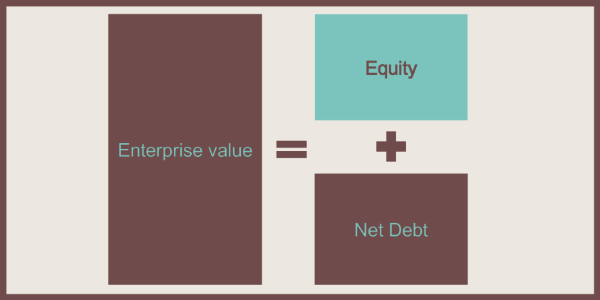
If we are interested in assessing how Fund Managers perform, we should focus on Equity and, in particular, on how fund managers are able to increase its value during their ownership of a company. We know that Enterprise value is made up of two components: Equity and Net debt, that is, debt minus cash. Consequently, Equity will be Enterprise value – Net Debt.

Screenshot 2015-08-17 22.08.38

We can also see Equity as made of the following components: revenues, EBITDA margin, EBITDA multiple and a measure of leverage. Or for the more mathematically inclined:

Screenshot 2015-08-17 22.26.50

If we are interested in knowing how fund managers are increasing the value of equity, we can assess the change by looking at the growth in these components.

Screenshot 2015-08-17 22.27.10

And since we are interested in breaking down the growth rate in the equity, we divide everything by (1 + CAGR(Equity)) to get:

Screenshot 2015-08-17 22.27.43

As we are interested in breaking the IRR down, we can take the log of both sides and using the log property logb(x ∙ y) = logb(x) + logb(y), we get:

Screenshot 2015-08-17 22.27.55

We need then to scale the growth to IRR, so we multiply both sides by IRR and we get:

Screenshot 2015-08-17 22.28.30

Which looks like a scary formula, but which in reality is not that bad.

Now that we have the theory down, we simply need to gather the ingredients and set up a nice spreadsheet to do all the “dirty” work for us.The only things we need are:

  • Revenues at entry and exit
  • Equity at entry and exit
  • EBITDA at entry and exit
  • Net debt at entry and exit

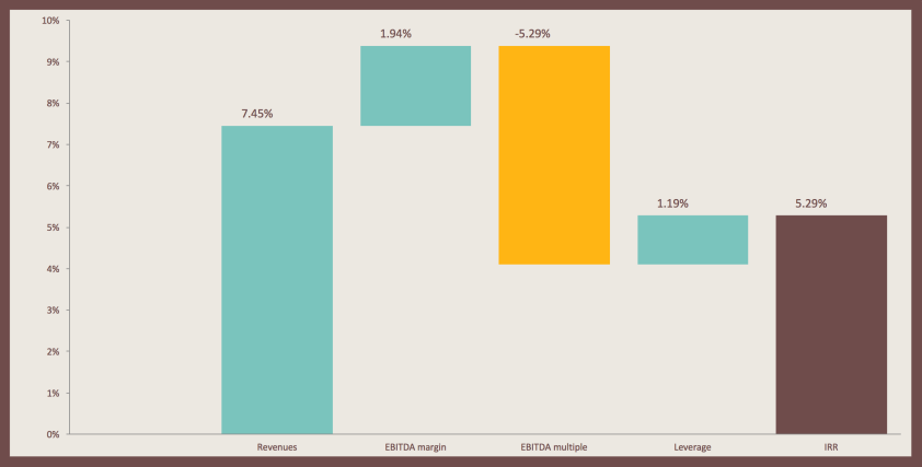
I have set up a simple spreadsheet with some sample data to play around (which you can download here if you so wish). This breakdown makes it very simple to visualize IRR components, especially if you enlist the help of a handy waterfall chart.

Screenshot 2015-08-17 22.10.05

A walk on the Sell Side

I am not one of those people who decided they wanted to be a pilot when they were 7 and shaped their life path to fit that goal. I believe that, unless you’ve actually tried something, you will not really know what it is like and you will definitely not know if it fits you.

Therefore I was very happy when I got the chance to try my hand at being a sell side analyst, admittedly for a short time. I would like to share some of the lessons I learned and why I think I will not pursue this as my career path in the future. But let’s start from the basics.

What does a sell side analyst do?

A sell side analyst, who usually works for a broker, is tasked with coming up with new investment ideas and developing a research report covering one or more companies, usually in a particular industry. The sell side analyst typically follows either a top down or a bottom up approach to arrive at a recommendation. In the first case, an industry trend, such as for example the Internet of Things or the rise of fast casual dining, will provide the first basis for a stock screening. In the second case, the analysis starts from a single company.

During the research and after the recommendation has been written, the analyst will closely follow the company, interacting with HR representatives, reading the news and speaking with industry experts, to continuously update her findings.

The ultimate goal for a sell side analyst is to convince institutional clients to buy shares in the company and to direct their trades through her employer’s trading desk.

My experience

My brief experience as a Sell side analyst taught me much and more. I appreciated the chance of building models and coming up with investment ideas and I enjoyed getting to know new sectors and companies and their financials. However not everything is perfect on the sell side. So here are my unstructured thoughts.

1) Global vs local broker
I have two contrasting view on this. Having a Sell side analyst team might work better in large global brokers who have access to networks of experts, and who can hire specialised employees to cover every sector. It all becomes more difficult for smaller firms, who may not have the resources to hire industry pundits, unless they only want to focus on a few sectors. On the other hand, bulge bracket firms might be more interested in just maximising the number of issues they cover, while boutiques may be able to track trends much more efficiently, as they are not expected to cover every blue chip out there.

2) No skin in the game
The analyst is usually barred from owning the stock she recommends, for fear of conflict of interest. Were the analyst to own the stock, it would be in her interest for others to buy it, in order for the price to increase. However this also means that the analyst does not really care if the stock tanks. Her reputation with clients will suffer, however the “pain” will be limited.

3) Risks for investors are not clearly highlighted
It is spelled out in the name. The job of a sell side analyst is to sell the recommendation, which prompts analysts to overemphasise positive aspects of the stock they are recommending. In analysts’ reports, the “risks” page is usually very brief. However no stock is perfect, and it should be the job of an analyst to point out risks to clients. This however is contrary to the analyst’s incentives, as it is her job to direct trading to her broker. And if clients are informed of risks, they might decide not to buy the stock. Bye bye commissions!

4) Pressure to come up with new ideas, and reluctance to embrace those same ideas
Nobody is interested in hearing the same story for the 10th time. So it is the job of the analyst to come up with new interesting takes. However the recommendation might not be well received if the idea is perceived as being too novel, both on the employer side, because it might be too hard to sell, and on the client side, as they might be too conservative.

5) Positive bias
It is quite common for analysts to be labelled as bullish, given the fact that the majority of their recommendations are “BUY”s. I do not believe this is because analysts are more optimistic than other markets participants. I think this might be down to the fact that the analyst needs to interact with Investor Relation representatives, who might not be very forthcoming if the analyst has recommended shorting the stock.

6) Need for expert knowledge
To be a good analyst one would theoretically need to be an industry expert and to be very good at finance as well. That is not the case in many instances, leading to brokerage report that are, often, inaccurate.

7) Chinese walls
If a broker is also involved in IB activity, it does not pay to have its analyst slap a SELL label on the company. Of course, there are regulations in place to try to prevent conflict of interest, however one does wonder how effective these measures are. As anybody who has ever taken a close look to any broker reports can probably say, I am inclined to believe not very effective.

So where does this leave us?

Ultimately, in my opinion, it all boils down to this question:

Why be a Sell side analyst when you can be a Buy one?

Buy side analysts do not need to stress positives too much, are not getting paid via “indirect” revenues, have more freedom on where to focus their research efforts, do not have conflict of interest with their non-existing IB divisions, and, more importantly, they are working for themselves. Being a Buy side analyst makes more sense to me than being a Sell side. But I might be completely wrong, as I have not tried being on that side. At least, not yet.

Banana Splits

Since the beginning of the year, companies have spun off over $1.6 trillion worth of subsidiaries globally, according to Dealogic. During the past 3 weeks alone, a number of large companies have announced plans to split up, signaling a shift from what has been a trend to chase synergies to one that places greater importance on focus. The explosion of these types of announcements has prompted me to ask myself a simple question: why? As I dag deeper into the subject I found there are a number of possible explanations. And a number of potential beneficiaries.

But, before we start, let’s recap what happened in the past month:

Source: Yahoo Finance, Company Annual Reports

Source: Yahoo Finance, Company Annual Reports

  • eBay, the online retailer with a $65B market cap, has announced on the 30th of November that it will spin off its PayPal division. PayPal, founded by the likes of Peter Thiel and Elon Musk, was acquired by eBay back in 2002 for $1.5B, and has grown so far as to be worth half of eBay’s current capitalization (that’s $32B for those of you who hate math).
  • HP, one of the cornerstones of the US tech industry, is ready to peacefully separate its personal computer and printer business from the software and enterprise side of the business. The consumer business will be called HP Ink, sorry, I meant Inc, while the sexier corporate side will be called, aptly enough, Hewlett-Packard Enterprise. Both companies will be about the same size, as the consumer business brings in revenues of 55B, while the enterprise side weighs in at 59.
  • Symantec, better known for its anti virus software Norton, will be divided in two by the end of next year. One company will focus on cybersecurity, the other on storage and data management. Symantec currently trades a discount compared to other similar software companies, such as FireEye, with EV/EBITDA at 6.1.
  • BlackStone has announced it will be acquiring PJT partners, a boutique investment bank (20th on the league tables), combining it with its advisory business, and spin off the resulting division. The advisory business, which is growing at 14% compared with the rest of the company’s 65%, contributed 6.7% of revenues in FY 2013.

Why

Why do companies suddenly decide to part ways and start a new life? Let’s explore some options.

Source: Company Annual Reports, Cass M&A Research, Activist Insight, Bloomberg

Source: Company Annual Reports, Cass M&A Research, Activist Insight, Bloomberg

Matches made in hell. Aka bad mergers
CEOs famously want to expand their companies, and sometimes do not stop to think if a deal really does make sense going forward, or they do not properly integrate the merged companies, with the result that the much-vaunted synergies end up never materializing. Symantec is a prime example. The company bought the storage firm Veritas in 2005 for a whopping $13.5B, betting that customers would want a one-stop-shop for storage and security. However, they never did, and Symantec was not able to properly integrate the two divisions, wasting Veritas’s market leadership position in as enterprise backup solution vendor.

The strategy does not work anymore
Whether the company was created through a merger or whether internal diversification caused the company to lose focus, it may be that the strategy currently pursued is not suitable anymore. For example, eBay bought PayPal to secure a strong payment option for its customers. PayPal has since grown its revenues from 1 to $6.6B, and operating profit increased 5.6x times. eBay has become an obstacle to PayPal’s growth, with companies such as Amazon refusing to use the service because it is owned by their rival.
Another example is HP, which bought Compaq, the PC manufacturer, back in 2001, to decrease costs while sourcing hardware components. With components becoming commoditised, savings obtained from combining orders for server and PC parts quickly faded.

You are growing too fast
The value of a firm is usually discounted when a faster growing division is “trapped” into a conglomerate. Businesses growing at different rates moreover need to be managed in very different ways: fast growing PayPal for example requires more investments than stable eBay, who needs to focus on margin expansion and profits.

Who are we selling to?
Sometimes, the two divisions are catering to completely different clients, which makes it harder to manage the company as a coherent whole.
In BlackStone’s case, the advisory division would have increasingly had to face conflict of interests between its clients and BlackStone’s own asset management businesses. The conflicts arise then the firm tries to win a mandate to sell an asset which its private equity business may have an interest in, for example in corporate restructuring the advisory side of Blackstone would be in conflict with the company’s division that buys distressed debt.
In HP case, the enterprise side will be catering to business clients, while the PC and printer side will have to satisfy retail customers, making for a completely different strategy and organization.

Activist Investors
An activist investor buys a lot of shares in a public company he believes to be mismanaged, tries to obtain a seat on the board and bugs management to change the way the company operates or redistributes earnings to shareholders.
Activist hedge funds have returned 22% in 2013, according to Activist Insight, and have more than $110B in dry powder, according to HFR. With more than 230 activist- launched initiatives in 2013 alone, names such as Carl Icahn, Starboard Value, Elliott Management, and ValueAct Capital are fast becoming the reasons behind many of today’s corporate activities.

Who is to benefit?

Workers
Having a smaller, more nimble company allows employees to focus more clearly on their job, and hopefully have a boss who is interested in the part of the business she is leading.

Investors
A growing business is valued differently from a stable one. If a company includes both, the market will usually penalize the stock. In addition, firms that are seen as prone to over-diversification will suffer from a “diversification discount”. Numerous academic studies find that stocks tend to “pop” the day a demerger is announced, gaining on average 3.3% better than the market.
When the actual split happens, shares end up in the hands of investors who might not want them or index funds, which must sell them. In addition, spin offs are usually not covered by analysts. As a result, spun off companies can usually be bought at a discount. The Bloomberg US Spin off Index is up 14.4 YTD, versus SP500 performance of 5.7%

Private equity firms
Smaller firm divisions, especially if they have stable earnings and generate cash, may become PE targets, especially if they are trading at a discount. Of course there is a reason why a stock is cheap, but a PE investment could potentially streamline operations and increase efficiency. Symantec’s security software division could be one such opportunity.

Investment bankers
Any corporate activity brings fees. And, according to Dealogic, banks have collected $9.4B from de-mergers this year alone. Not too shabby, if you ask me.

To pay or not to pay. The VAT conundrum

You have just moved into your new apartment and want to paint the walls with a color you like better than that awful mauve the previous owner has plastered the house with. You call a decorator and ask him for an estimate. If you happen to be in Italy, you will probably be offered two prices: one including taxes, the other “tax-free”. And you will most probably choose to pay the latter one, given that it is at least 20% less than the former.

As tax evasion is such a big problem in my home country, I just wanted to highlight pros and cons of not paying VAT (or IVA, as it is called in Italy) on the services and goods you purchase and what consequences that might have on the broader economy. But let’s start with some background first.

The reasons

Tax evasion exists in every country in the world, however there are staggering differences in its size and impact between different nations. Italy always ranks in the top of the charts, no matter if we consider the amount of lost tax revenue or the size of the shadow economy. In my opinion, there are two fundamental reasons why people decide to not pay taxes.

Screenshot 2014-10-05 17.38.29

Screenshot 2014-10-05 17.38.18

  • Moral Reasons. When the State is seen as an oppressor or when there is a lack of civic responsibility, tax evasion rates tend to be higher, the reasoning being that I would not want to pay taxes to an entity I do not think I belong to and who I simply see as a despot.
  • Economic Reason: taxes are perceived to be too high, and citizens believe they are not getting sufficient services compared to what they are paying. Government spending and tax revenue as a percentage of GDP tend to go hand in had (see graph), however spending does not necessarily equate to quality services.

GDP TAX

Pros
If we take that humans tend to evade taxes for the two reasons highlighted above, it follows that both pros and cons of not paying must be related to economic as well as moral reasons.

  • Moral “benefit”. We feel smart accomplices to a crime against the oppressor state, which we believe is not capable of using the money we contribute in effective ways to guarantee healthcare and other services. In addition, as customers we know it is highly unlikely we will be caught not paying the VAT and therefore we have little to no risk.
  • Economic benefit. Why pay 20% more to have my room repainted green, when it is being offered for 800€ instead of 1000? It is crystal clear that if we are offered the opportunity to pay less for the same service, we will most probably accept it. The “savings” are immediate and tangible, and this pushes consumers to accept to not pay taxes, almost as if it the contractor, the painter or the owner of a restaurant was giving us a nice fat discount.

Cons
At a more detailed analysis, the pros turn out not to be such pros after all.

  • Moral “disadvantage”: you are still doing something illegal. Although you are not liable as a customer if the merchant does not give you a receipt, at least in Italy, you are still helping him not pay taxes.
  • Economic disadvantage: what at first looks like a discount turns out to just be a favor we are doing to the painter. He does not have to pay the VAT on what we have purchased to the state on our behalf, but more importantly he never earned those 800€ and therefore they will not be computed as part of its revenue, exempting him from paying income taxes. In addition, since he had to pay VAT on the raw materials he used to paint, he has accumulated a tax credit. Let’s run some numbers: assuming raw materials cost 300€, he will have a VAT credit of approx. 60€. In addition, he will not pay income tax on the 700€ profit, equal to around 210€. His net benefit is 270€.

Screenshot 2014-10-05 17.32.18

  • You might want to argue against the particular example, but thinking through it logically, it must be that his benefit is much higher than yours, otherwise it would not be even worth it for him to not make you pay VAT. With the illusion of making you pay less, he pockets a much larger sum.In addition, tax evasion on his part means that in the end you will have to pay higher taxes, since he will still go to the hospital if he feels sick, and he won’t be paying for it. You will.

So?
Everything considered, I see three possible courses of action:

  • Ask for a higher “discount”. Given that the merchant is actually benefitting more from not making you pay the VAT, you should ask for a larger discount. Otherwise you are just doing him a favor and helping him break the law.
  • Not paying the VAT only makes sense if you yourself have revenues that have not been accounted for, that is, if you have earned any amount on which you have not paid the VAT. This way you get rid of “black” money the same way you got it.
  • I think the shadow economy is actually tolerated if not actively encouraged by the state, despite all the public statements about the renewed efforts against tax evasion. I really do not see the police cracking down on merchants who are not paying what they owe. Therefore, a possible solution is to open a restaurant and benefit directly.

Or you could simply refuse to do business with anyone who even so much as offers you a discount if you agree to not pay the taxes. But we all know that is never going to happen.

Cocktail Straws

It’s been a long time since I posted anything here. And this is probably going to be the silliest post yet.

Whenever I go out for a drink, I always wonder why bartenders give 2 straws with cocktails, and why sometimes they don’t give one at all. I decided to investigate, and compile all the possible (conspiracy) theories here. Clearly, I have nothing better to do with my life.

Let’s start with some numbers, because otherwise it’s not fun:

  • 5000 years old: that’s how old the first straw is. It was found in a Sumerian tomb. It was quite a fancy straw to boot: gold with lapis lazuli inlay.
  • 1888: year when Marvin Stone patented the modern paper drinking straw, which was made wounding waxed paper to form a tube
  • 13: the number of different types of straws in existence (at least according to Wikipedia), including candy straws, color-changing straws and flavor straws.
  • 500 million: number of straws used in the US every day, according to BeStrawFree. That’s 1.6 straws per citizen. And that’s also a lot.
  • 10 000$: cost a straw-making machine. I’m actually tempted to go buy one.

The way straws function is usually misunderstood. When you are drinking, you suck the air out of the straw, decreasing pressure inside the tube and therefore allowing the liquid to be pushed up inside the straw by the higher surrounding air pressure. It is the air outside that is actually pushing the liquid up, not you pulling it. So, in outer space, where there is no air pressure, a straw would not work.

With physics out of the way, let’s go back to the original question: why do bartenders give us straws to put in our drinks? Here are some of the possible answers.

  • Enhance flavor: the first possible explanation is that straws help the liquid aerate, meaning that CO2 is absorbed, bringing out the aromas and smells of the drink. In addition, drinking through a straw makes it easier to taste better, because it maximised the flow of liquid to your palate. I do not think this is right, because otherwise we would be drinking wine with straws. Which we do not do.
  • Make it easier to drink: drinks that have a lot of ice, especially crushed ice, can be hard to drink. Your teeth freeze and the ice cubes are bothersome. Making the liquid flow up the straw warms it and makes it better-tasting. But if this were true, they would give you straws when ordering whisky on the rocks. Which does not happen.
  • The bartender actually uses the straw to get a sip himself: I have seen this happen once, but I don’t think this could be a reasonable explanation. At least, I sincerely hope it is not!
  • Lipstick: bartenders are lazy and do not want to spend 15 minutes trying to clean a used glass after some girl has smeared her lipstick all over it. But then, why do they give straws to men as well?
  • Just to stir: to keep you from leaving your hands idling about, what best alternative than to give you a small straw to stir your cocktail and see all the ice cubes happily swirling around? If this was the reason, couldn’t the bartender just stir the cocktail himself before giving it to you? And couldn’t he give you a simple stick instead of a straw?

Now on to the second question: why are we sometimes given 2 straws, not just one?

  • Share your drink: giving you an additional straw allows you to generously share your drink with a friend. Too bad you are given 2 straws even when you are sitting at the bar alone. And if you are not comfortable sharing the same straw or glass with a friend, I doubt you would be willing to share your drink at all.
  • Making you drink slower: since you cannot close your mouth snuggly around two straws, you are left with a small gap in between and part of your “suction power” will be lost inspiring air instead of liquid when you drink. This of course would not apply if you were to put the straws to each corner of your mouth. But then you would look like an idiot. This does not sound like a convincing explanation, and empirical tests carried by yours truly prove it wrong.
  • It is actually a secret code: one straw means alcoholic drink, two mean non-alcoholic, for example. Or you might have a different number of straws to distinguish between similar cocktails. I guess this one depends on the bar, but so far I have not witnessed any instance when this answer turns out to be true.
  • Making you drink faster: getting more surface area means that you are able to suck in more liquid. As long as your suction power is strong enough, you will be more efficient in drinking through 2 straws. If they gave you 10 though, you would probably not be able to effectively drink though all of them at once. Making you drink faster, the theory goes, would convince you to order another drink. In fact, I’ve noticed that while cocktails tend to come with double straws, soft drinks usually only come with one straw. It could be plausible that the bar, which makes a higher margin on alcoholic drinks, would want you to drink faster. If that were true though, and if all the bar wanted was for you to finish your drink faster, it would be better for them to not give you a straw at all. After all, drinking directly from the glass is faster than sucking up liquid through a straw. In addition, it is not true that if you finish your drink sooner you’ll be inclined to order a second one. Most likely, if you order a second glass, you would have done so regardless of how fast (or slow) you had drank your first one.

Inconclusive conclusion:

  • Straws are completely useless: they might be enjoyable, and sometimes useful for hospital patients who cannot sit upright to sip a drink. Otherwise, we would probably be better off not wasting plastic making these silly drinking tubes.
  • The 2-straws-with-cocktail remains a mystery: I’ll probably ask a bartender directly next time and see if he/she can come up with a satisfying answer. Until that time, the “mystery” will remain, since none of the hypothesis I made seems to stand up to criticism.

Thanks for reading this far, hope this didn’t bore you to tears. And now go do something more productive with your life :3