When you wake up in the morning and look at yourself in the mirror, what do you see? A woman? A Black man? A Christian? A queer person? If you’ve answered “a human being”, it means you consider yourself to be a generic person, with no race, no class, and no gender. And you are most likely a white male: privilege is invisible to those who have it.
I was feeling uncharacteristically happy, so I decided to dampen by mood a bit by looking at these wonderful statistics from the European Union on discrimination. Admittedly, the data is almost 2 years old, however I imagine attitudes would not have shifted massively over the period.
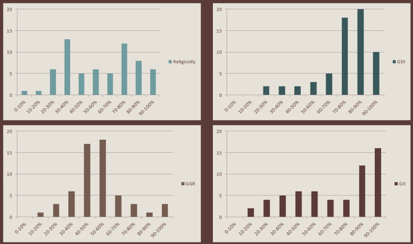
The demography of minorities
How diverse is Europe, really? The following charts show the percentage of survey respondents that consider themselves part of a minority in their respective countries. I have graphed all to the same scale, to make the statistics more easily comparable across different diversity groups. We can immediately note that race and religion diversity are much higher than the prevalence of different sexual orientations or disabilities (on average by a factor of 3x).
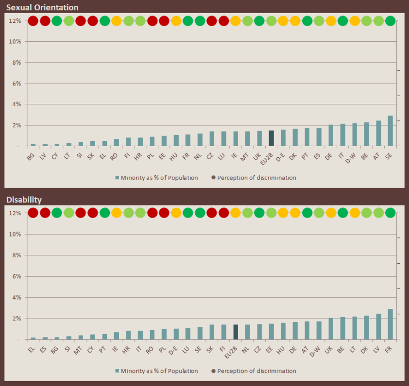
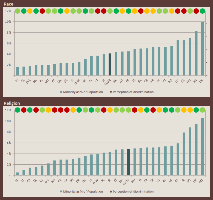
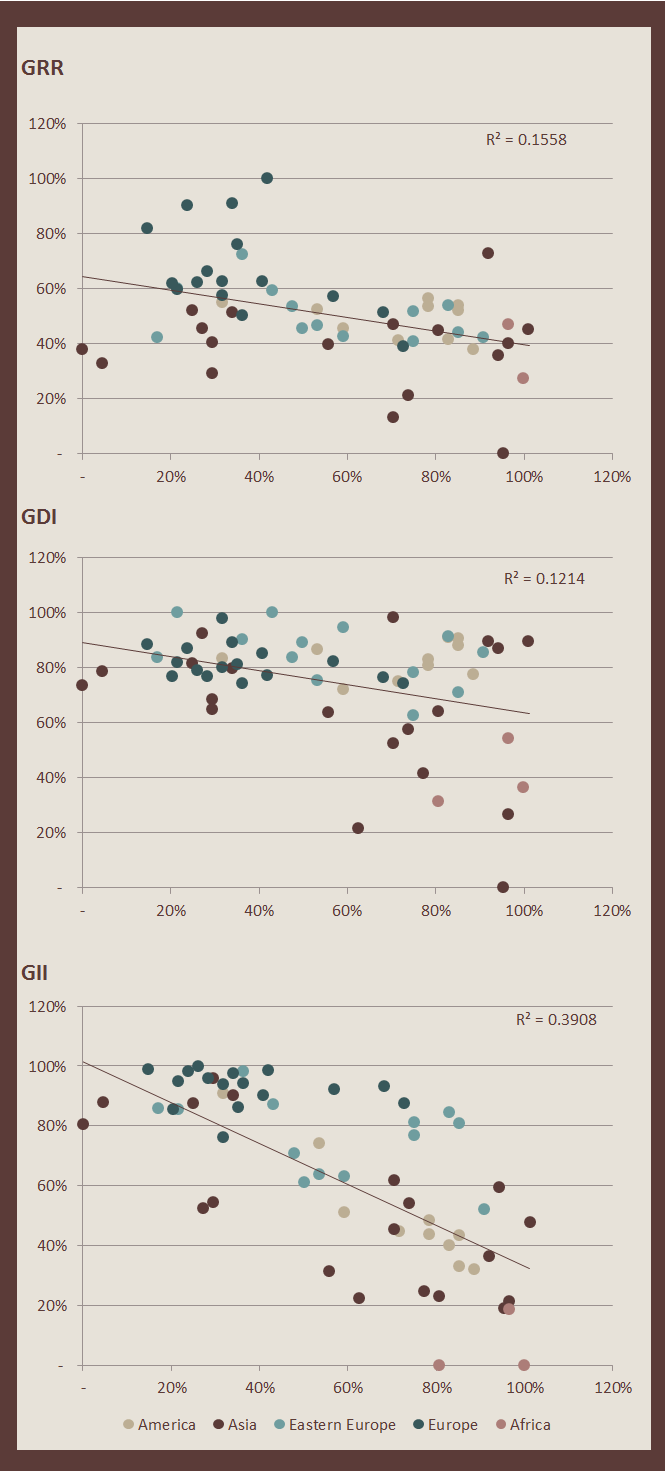
I was interested in comparing the prevalence of minority groups to the perception of discrimination in every country. I grouped the perception of discrimination in quartiles, and charted it on the top: the red dots indicate countries in the bottom quartile, that is, countries residents believe to be quite discriminatory. The green dots on the other hand mark countries in the top quartile, that is, countries that are more accepting. Are perception of discrimination and diversity by type correlated? I checked with a quick regression: the R^2 are very low, sub 5%, however there appear to be a couple of patterns:
- People could be reluctant to disclose their belonging to a minority in countries where discrimination is high. If this were true, we should observe higher prevalence of “concealable” minorities (we can quite easily hide homosexuality, you cannot hide the colour of your skin) in more accepting countries. We can see a higher prevalence of “green dots” to the right in the sexual orientation chart: this means more queers in more tolerant countries, substantiating the point. (It could also be that sexual minorities move to more tolerant countries, thus inflating the numbers…).
- Higher prevalence of diversity could lead to higher acceptance of such diversity. This seems to be the case for sexual orientation and disability (more green dots to the right), however, worryingly, not in the case of race: a lot of red dots in countries where there is a sizeable ethnic minority. I cannot assess whether this is an indication of a backlash against recent immigration or not without trend data however.
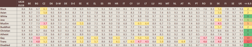
A survey on hypocrisy
Have a look at the following tables. These show the average score people reported when answering the following two questions:
- Regardless of whether you are actually working or not, using a scale from 1 to 10, how comfortable you would feel if one of your colleagues at work belonged to each of the following groups?
- Regardless of whether you have children or not, using a scale from 1 to 10, how comfortable you would feel if one of your children was in a love relationship with a person from each of the following groups?
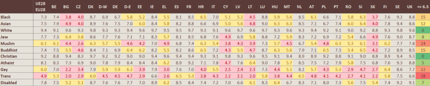
I highlighted scores below 5 in red (ie. not comfortable) and scores below 6.5 in yellow (ie. slightly comfortable). People may be broadly accepting to work with folks who are different from them, however they are clearly not ok with their kids dating a member of a minority. Especially if they happen to be Trans, Muslim or Gay. ‘nuff said. I think the percentage of people who are not ok with one of their children dating a same sex partner is even more problematic, as parents are implicitly saying they could not accept that their kid was gay if they found out.
Kissing in public is gross*
*If you are Gay
How comfortable would you feel, on a scale of 1 to 10, if a couple were showing affection in public (e.g. kissing or holding hands)? On average, Europeans say 7.5. But if the couple happens to be two girls, we go down to 5.8, and if it’s two guys, 5.5. I wanted to compare the variance in percentage terms, as the simple difference would not take into account the fact that in some countries any type of PDA may be considered inappropriate.

The map above shows the percentage difference for gay vs straight in different Europeans counties: the higher the percentage (the darker the country), the less acceptable it is to kiss your boyfriend in public if you happen to be a guy. You might want to check it out before deciding on your next holiday destination, if you are queer and plan on travelling with your significant other…
You got a friend in me
Does having a “minority friend” (man, that sounds awful) make you more accepting? Evidence is mixed. The table below shows the R^2 output for the regressions where the independent variable is the share of survey respondents who say they have a friend who belongs to a minority group and the dependent variable is one of the following:
- Is discrimination against [appropriate minority group] rare?
- Would you feel comfortable if the highest elected political position in your country was a member of [appropriate minority group]?
- Should school lessons and material include information about diversity in terms of [appropriate minority group]?
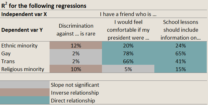
I highlighted the cells with different colours depending on whether the slope coefficient was negative (inverse relationship) or positive (direct relationship), and checked if the slope was significant.
- When considering perception of discrimination, it looks like having a “minority friend” will not impact positively. On the contrary. For the two cases where the slope is significant, the reverse is true: having a minority friend will lead you to believe discrimination in your country is more widespread. Maybe it’s because you realize how much worse the rest of society is treating your friend compared to how they are treating you?
- Things look rosier for the other two statistics: in countries where more people have a friend who has a different ethnic background, sexual orientation, gender identity or religion believing that schools should teach diversity and that a gay or Buddhist president would not be such a bad thing is more common. (Or it could just be that more open people just tend to have more diverse friends…)
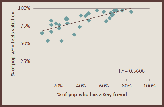
Bonus point: Do people who live in countries where it is common to have a more diverse group of friends feel more satisfied with their life? Looks like they do! Especially if their friend happens to be gay (see chart below). Guess the whole GBF thing actually has some merits (¬‿¬)
So what?
I’m no statistician, these are simple observations gathered from the data and I have not controlled for any other variable while coming up with my conclusions. There are a myriad of different issues that may impact the outcome of the analysis (demographic and social composition in the different countries, openness and willingness to reply truthfully to a survey, age, …) however I do believe the conclusions are relevant and important. The data shows we are still living in a society that is not as accepting as we might want it to be, and sometimes, living in a large city like London, it is easy to forget that there are still places in Europe where whoever is different from the majority still faces discrimination. There is some hope though: more visibility, especially through friendship and representation in the media, can help change things. Let’s hope this will continue to be the case in the future and let’s look forward to when it will not be necessary to have surveys such as this.